
How Virtual Tags have transformed SCADA data analysis

Peter Prevos |
923 words | 5 minutes
Share this content
Yesterday, I delivered the International Keynote at the Asset Data & Insights Conference in Auckland, New Zealand (the place where R was initially developed). My talk was about creating value from CADA data using a method I developed with my colleagues called "Virtual Tags." My address started with my views on data science strategy, which I also presented to the R User Group in Melbourne. In this post, I would like to explain what Virtual Tags are and how they can be used to improve the value of SCADA data.
SCADA Systems at Water Treatment Plants
Water treatment plants are mostly fully automated, using analysers and the SCADA system to communicate this data. For those of you not familiar with water treatment plants, the video below gives a cute summary of the process.
Water treatment plants rely on sensors to track a broad range of parameters. These instruments capture data around the clock, supporting real-time operational decisions. When everything runs smoothly, all values stay within a precise band. Typically, these values are archived by the SCADA system for a year, then purged to manage storage needs.
Turbidity measurements—essentially a gauge of water clarity—help assess filtration effectiveness at water treatment plants. Below, you’ll find a code snippet simulating five hours of turbidity readings from one such instrument. Most of the time, these water quality values follow a log-normal distribution and cluster tightly together, making them ideal for precise monitoring.
  # Virtual tag simulation

  # Generate turbidity measurements
  set.seed(1234)
  n <- 300
  wtp <- data.frame(timestamp = seq.POSIXt(ISOdate(1910, 1, 1), length.out = n, by = 60),
                    turbidity = rlnorm(n, log(.1), .01))

  library(ggplot2)

  p1 <- ggplot(wtp) +
    aes(x = timestamp, y = turbidity) +
    geom_line(colour = "grey") +
    ylim(0.09, 0.11) +
    theme_bw(base_size = 10) +
    labs(title = "Turbidity simulation", x = "Timestamp", y = "Turbidity")

  p1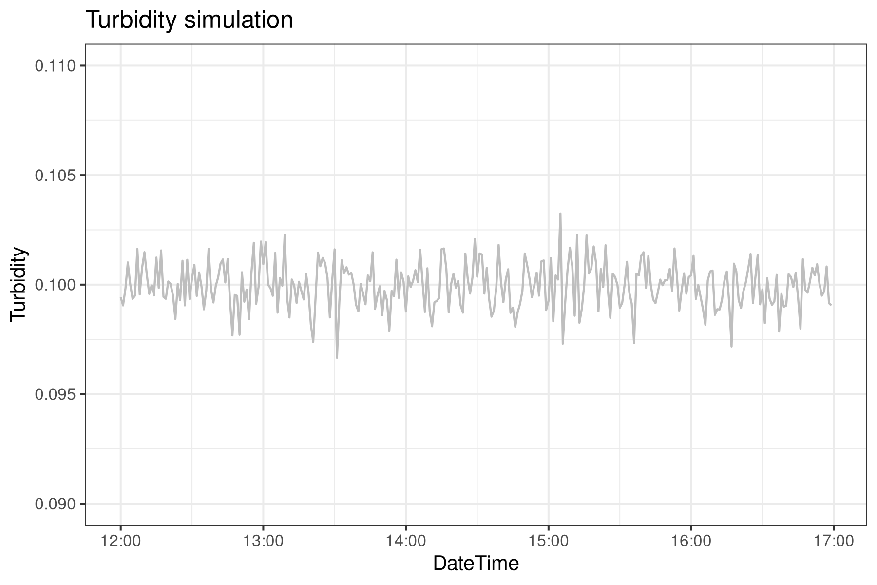
SCADA Historian
The data generated by the SCADA system is used to make operational decisions. The data is created and structured to make decisions in the present, not to solve problems in the future. SCADA Historian systems archive this information for future analysis. Historian systems only store new values when the new reading is more or less than a certain percentage of the previous one. This method saves storage space without sacrificing much accuracy.
Imagine an instrument reads 0.20, and the limit is 5%: you’ll see new values recorded only when they fall below 0.19 or above 0.21. Each subsequent value gets stored only when it deviates by 5% from the last stored point. The following code snippet brings this process to life, simulating it using earlier turbidity readings. Notice: this Historian captures and stores only the data points shown in black.
  # Historise using dead banding
  threshold <- 0.03
  h <- 1 # First historised point

  wtp$historised <- FALSE
  wtp$historised[c(1, n)] <- TRUE # Testing for delta > threshold

  for (i in 2:nrow(wtp)) {
    delta <- wtp$turbidity[i] / wtp$turbidity[h]
    if (delta > (1 + threshold) | delta < (1 - threshold)) {
      wtp$historised[i] <- TRUE
      h <- i
    }
  }

  historian <- subset(wtp, historised)

  p2 <- p1 +
    geom_point(data = historian,
               aes(x = timestamp, y = turbidity),
               size = 3, alpha = .5, color = "blue") +
    labs(title = "Historised data")

  p2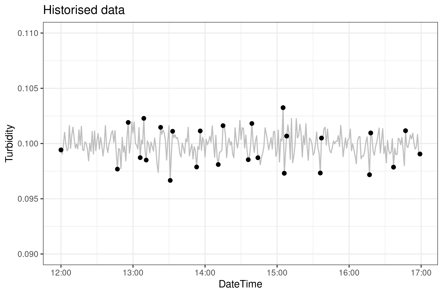
Virtual Tags
This standard method for generating and storing SCADA data works well for operational systems but not for post hoc analysis. The data in Historian are unequally spaced, making them harder to analyse. Using constant interpolation, the Virtual Tag approach expands these unequal time series into an equally spaced time series.
The vt() function undertakes the constant interpolation using the approx function. The function vt is applied to all the DateTime values using the historised data points. The red line shows how the value is constant until it jumps by more than 5%. This example demonstrates that we have a steady process with some minor spikes, which is the expected outcome of this simulation.
  # Virtual Tags extrapolation

  vt <- function(t) {
    approx(historian$timestamp, historian$turbidity, xout = t, method = "constant")
  }

  turbidity <- lapply(as.data.frame(wtp$timestamp), vt)

  wtp$virtual_tag <- turbidity[[1]]$y

  p3 <- p2 +
    geom_line(data = wtp,
              aes(x = timestamp, y = virtual_tag), colour = "red") +
    ggtitle("Virtual Tags")
  p3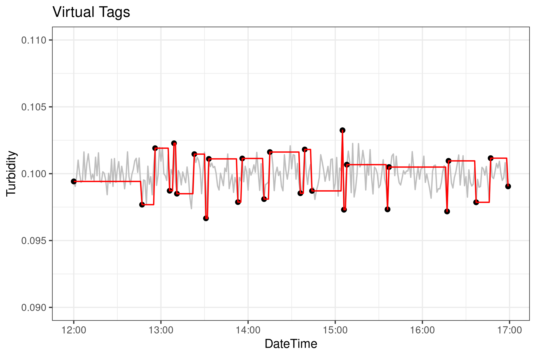
The next step in Virtual Tags is to combine tags from different data points for richer insights. For instance, imagine you're curious about turbidity readings only when the filter is running. By combining this data with information such as the filter's valve status and flow, you can gain a clearer picture of system performance.
Although this approach may seem cumbersome at first glance, it makes analysing data from SCADA Historian much more straightforward. With Virtual Tags, you can easily access a catalogue of analytical processes that would otherwise be challenging to perform. This system also provides valuable context for your SCADA information by linking tags to one another and to the operational processes they reflect. Curious to learn more? Download the technical manual for an in-depth look at Virtual Tags and their implementation in SQL.
Interested in solving water challenges with R code? You might enjoy the book Data Science for Water Utilities, which goes deeper into practical techniques for the field.
Data Science for Water Utilities
Data Science for Water Utilities published by CRC Press is an applied, practical guide that shows water professionals how to use data science to solve urban water management problems using the R language for statistical computing.
Share this content
