Percentile Calculations in Water Quality Regulations

Peter Prevos |
869 words | 5 minutes
Share this content
Percentile calculations can be more tricky than at first meets the eye. A percentile indicates the value below which a percentage of observations fall. Some percentiles have special names, such as the quartile or the decile, both of which are quantiles. This deceivingly simple definition hides the various ways to determine this number. Unfortunately, there is no standard definition for percentiles, so which method do you use?
The quantile function in R generates sample percentiles corresponding to the given probabilities. By default, the quantile function provides the quartiles and the minimum and maximum values. The code snippet below creates semi-random data, plots the histogram and visualises the third quartile.
The code for this page is available on GitHub in case-studies/percentiles.R.
  ## Percentile calculations

  ## Example
  set.seed(1969)
  test.data <- rnorm(n = 10000, mean = 100, sd = 15)

  library(ggplot2)

  ggplot(as.data.frame(test.data), aes(test.data)) +
    geom_histogram(binwidth = 1, aes(y = ..density..), fill = "dodgerblue") +
    geom_line(stat = "function", fun = dnorm, args = list(mean = 100, sd = 15), colour = "red", size = 1) +
    geom_area(stat = "function", fun = dnorm, args = list(mean = 100, sd = 15),
              colour = "red", fill = "red", alpha = 0.5, xlim = quantile(test.data, c(0.5, 0.75))) +
    theme_bw(base_size = 8)
The quantile function with default settings and the 95th percentile give the following results:
quantile(test.data)
       0%       25%       50%       75%      100%
 39.91964  89.68041 100.16437 110.01910 153.50195
quantile(test.data, probs = 0.95)
     95%
124.7775
Methods of percentile calculation
The quantile function in R provides nine different ways to calculate percentiles. Each of these options uses another method to interpolate between observed values. I will not discuss the mathematical nuances between these methods. Hyndman and Fan (1996) provides a detailed discussion of these methods.
The differences between the nine available methods only matter in highly skewed distributions, such as water quality data. All methods provide the same outcome for the normal distribution simulated above, as illustrated by the following code.
sapply(1:9, function(m) quantile(test.data, 0.95, type = m))
     95%      95%      95%      95%      95%      95%      95%
124.7775 124.7775 124.7775 124.7775 124.7775 124.7775 124.7775
     95%      95%
124.7775 124.7775
Percentile calculations in water quality
The Australian Drinking Water Quality Guidelines (November 2016) specify that: "based on aesthetic considerations, the turbidity should not exceed 5 NTU at the consumer's tap". The Victorian Safe Drinking Water Regulations(2015) relax this requirement and require that:
The 95th percentile of results for samples in any 12 months must be less than or equal to 5.0 NTU.
The Victorian water quality regulator also specifies that the percentile should be calculated with the Weibull Method. This requirement raises two questions: What is the Weibull method? How do you implement this requirement in R?
The term Weibull Method is confusing as this is not a name generally used by statisticians. In Hyndman & Fan (1996), this method has the less poetic name $\hat{Q}_8(p)$. The Victorian water quality regulator references McBride (2005), who calls it the Weibull method. Waloddi Weibull, a Swedish engineer famous for his distribution, was one of the first to describe this method.
This theoretical interlude aside, how can we practically apply this to water quality data?
If you are interested in how the Weibull method works, the weibull.quantile() function below calculates a quantile p for a vector x using this method. This function gives the same result as quantile(x, p, type = 6).
  ## Weibull method
  weibull.quantile <- function(x, p) {
    # Order Samples from large to small
    x <- x[order(x, decreasing = FALSE)]
    # Determine the ranking of percentile according to Weibull (1939)
    r <- p * (length(x) + 1)
    # Linear interpolation
    rfrac <- (r - floor(r))
    return((1 - rfrac) * x[floor(r)] + rfrac * x[floor(r) + 1])
  }
  weibull.quantile(test.data, 0.95)

  quantile(test.data, 0.95, type = 6)
124.777545386916
Turbidity Data Example
Turbidity data is not normally distributed as it is always greater than zero. In this example, we use simulated data from a fictional water system called Gormsey. This data is also used in book Data Science for Water Utilities.
  ## Visualise Data
  library(tidyverse)

  gormsey <- read_csv("~/Documents/projects/r4h2o/data/water_quality.csv")
  turbidity <- filter(gormsey, Measure == "Turbidity" &
                               Suburb %in% c("Blancathey", "Tarnstead"))

  ggplot(turbidity, aes(Result)) +
    geom_density(fill = "dodgerblue", aes(y = ..density..)) +
    scale_x_continuous(trans = "log10") +
    facet_wrap(~Suburb) +
    theme_bw() +
    labs(title = "Turbidity Distribution",
         x= "log Results")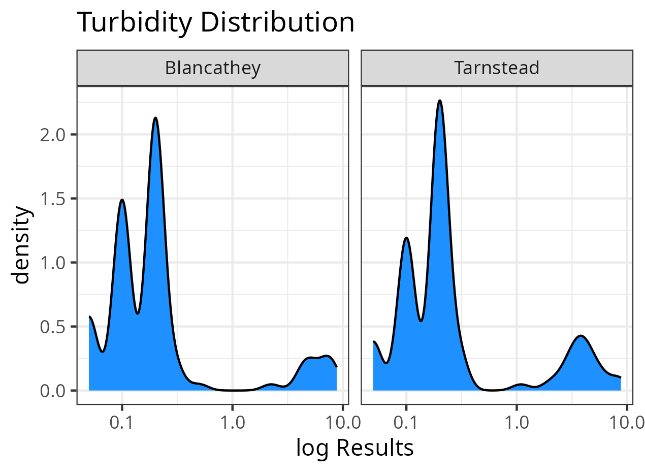
When we calculate the percentiles for all nine methods available in the base-R function, we see that the Weibull method generally provides the most conservative result for heavily skewed data.
  # Calculate all percentile methods
  tapply(turbidity$Result, turbidity$Suburb,
         function(x) sapply(1:9, function(m) quantile(x, 0.95, type = m)))
$Blancathey
   95%    95%    95%    95%    95%    95%    95%    95%    95%
6.0200 6.0200 6.0200 5.8820 6.2720 6.6500 5.9165 6.3980 6.3665

$Tarnstead
     95%      95%      95%      95%      95%      95%      95%
4.480000 4.480000 4.480000 4.432500 4.607500 4.837000 4.442000
     95%      95%
4.684000 4.664875
Chapter 4 of my book Data Science for Water Utilities discusses calculating descriptive statistics with R

Data Science for Water Utilities
Data Science for Water Utilities published by CRC Press is an applied, practical guide that shows water professionals how to use data science to solve urban water management problems using the R language for statistical computing.
Share this content
