Pacific Island Hopping using R and the iGraph package

Peter Prevos |
922 words | 5 minutes
Share this content
Last month I enjoyed a relaxing holiday in the tropical paradise of Vanuatu. One rainy day I contemplated how to go island hopping across the Pacific ocean visiting as many island nations as possible. The Pacific ocean is a massive body of water between, Asia and the Americas, which covers almost half the surface of the earth. The southern Pacific is strewn with island nations from Australia to Chile. In this post, I describe how to use R to plan your next Pacific island hopping journey.

Geocoding the airports
My first step was to create a list of flight connections between each of the island nations in the Pacific ocean. I am not aware of a publicly available data set of international flights so unfortunately, I created the list manually by collecting route maps on Pinterest (if you do know of a fomal data set with international flights, then please leave a comment).
My manual research resulted in a list of international flights from or to island airports. This list might not be complete, but it is a start. My Pinterest board with Pacific island airline route maps was the information source for this list.
The first code section reads the list of airline routes and uses the ggmap package to extract their coordinates from Google maps. You will need a Google API to enable the geocoding function. The data frame with airport coordinates is saved for future reference to avoid repeatedly pinging Google for the same information.
  library(ggmap)
  library(ggplot2)
  library(ggrepel)
  library(geosphere)
  library(tidyverse)
  library(stringr)

  ## Google maps api
  api <- readLines("google.api") # Text file with the API key
  register_google(key = api)

  ## Read flight list and airport list
  flights <- read_csv("pacific/pacific-flights.csv")
  f <- "pacific/pacific-airports.csv"
  if (file.exists(f)) {
    airports <- read.csv(f)
  } else
    airports <- data.frame(airport = NA, lat = NA, lon = NA)

  ## Lookup coordinates for new airports
  all_airports <- unique(c(paste(flights$From, flights$From.Country, sep = ", "),
                           paste(flights$To, flights$To.Country, sep = ", ")))
  new_airports <- all_airports[!(all_airports %in% airports$airport)]

  while (length(new_airports) != 0) {
    coords <- geocode(new_airports)
    temp_airports <- data.frame(airport = new_airports, coords)
    airports <- rbind(airports, temp_airports) %>%
      filter(!is.na(lat), !is.na(lon))
    new_airports <- all_airports[!(all_airports %in% airports$airport)]
  }
  ## Remove countries and save
  airports$airport <- str_remove_all(airports$airport, ",.*")
  write_csv(airports, f)

  ## Add coordinates to flight list
  flights <- merge(flights, airports, by.x = "From", by.y = "airport")
  flights <- merge(flights, airports, by.x = "To", by.y = "airport")
Create the map
To create a map, I modified the code to create flight maps I published in an earlier article. This code had to be changed to centre the map on the Pacific.
Mapping the Pacific ocean is problematic because the -180 and +180 degree meridians meet around the dateline. Longitudes west of the antemeridian are positive, while longitudes east are negative. The world2 data set in the borders function of the ggplot2 package is centred on the Pacific ocean. To enable plotting on this map, all negative longitudes are made positive by adding 360 degrees to them and defining the antipode.
  ## Pacific centric
  flights$lon.x[flights$lon.x < 0] <- flights$lon.x[flights$lon.x < 0] + 360
  flights$lon.y[flights$lon.y < 0] <- flights$lon.y[flights$lon.y < 0] + 360
  airports$lon[airports$lon < 0] <- airports$lon[airports$lon < 0] + 360

  ## Plot flight routes
  worldmap <- borders("world2", fill = "grey", col = NA)
  ggplot() + worldmap +
    geom_point(data = airports, aes(x = lon, y = lat), col = "#970027") +
    geom_text_repel(data = airports, aes(x = lon, y = lat, label = airport), col = "black", size = 2,
                    segment.color = NA) +
    geom_curve(data = flights, aes(x = lon.x, y = lat.x, xend = lon.y, yend = lat.y, col = Airline), size = 1,
               curvature = .2) +
    xlim(90, 300) + ylim(-50, 50) +
    theme_void() +
    labs(title = "Pacific Island Hopping", subtitle = "lucidmanager.org")
  ggsave("pacific-flights.png", width = 6, height = 4)
Pacific Island Hopping
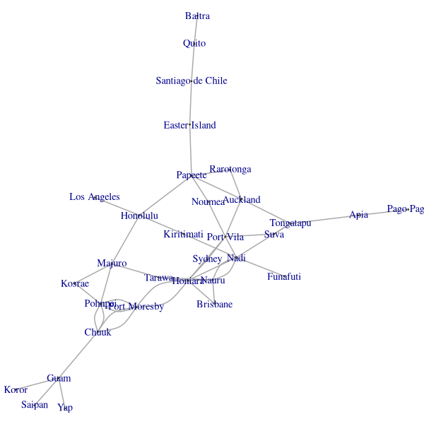
This visualisation is aesthetic and full of context, but it is not the best visualisation to solve the travel problem. This map can also be expressed as a graph with nodes (airports) and edges (routes). Once the map is represented mathematically, we can generate travel routes and begin our Pacific Island hopping.
The igraph package converts the flight list to a graph that can be analysed and plotted. The shortest_path function can then be used to plan routes. If I would want to travel from Auckland to Saipan in the Northern Mariana Islands, I have to go through Port Vila, Honiara, Port Moresby, Chuuk, Guam and then to Saipan. I am pretty sure there are quicker ways to get there, but this would be an exciting journey through the Pacific.
  library(igraph)
  g <- graph_from_edgelist(as.matrix(flights[,1:2]), directed = FALSE)

  png("pacific-network.png", width = 600, height = 600)
  par(mar = rep(0, 4))
  plot(g, layout = layout.fruchterman.reingold,
       vertex.size = 0,
       vertex.label.cex = 1.2,
       edge.width = 2)
  dev.off()

  shortest_paths(g, "Auckland", "Saipan")
This diagram looks a lot like a Polynesian stick chart. These are maps made from sticks bound together with strings. These maps allowed the per-colonial Polynesians to navigate between their islands. The maps are not mathematical projections of the earth, like our first map, but a logical model.
Stick charts indicate the local swell patterns that allowed the ancient mariners to find their way across the vast distances in the pacific. All we have to do is hop on a plane and we get to wherever we want withing a few hours.
Happy island hopping!
Share this content


