Analysing soil moisture data with the ncdf4 library

Peter Prevos |
782 words | 4 minutes
Share this content
The netCDF format is popular in sciences that analyse sequential spatial data. It is a self-describing and machine-independent data format for creating, accessing and sharing array-oriented information. The netCDF format provides spatial time series such as meteorological or environmental data. This article shows how to load this data type with the ncdf4 library. This article also shows how to visualise and analyse this data format by reviewing soil moisture data published by the Australian Bureau of Meteorology.
Soil Moisture data
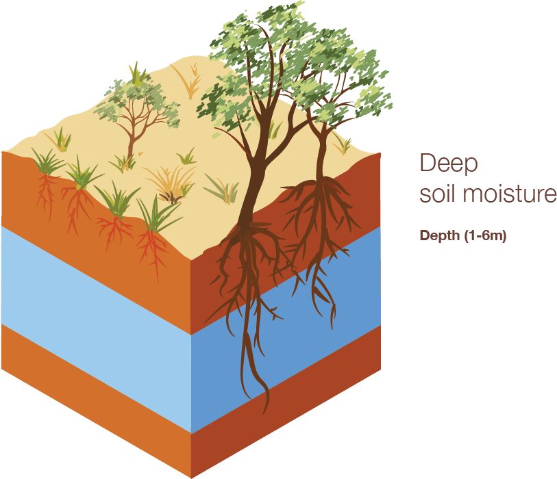
The Australian Bureau of Meteorology publishes hydrological data in the NetCDF format on their Australian Water Outlook. The NetCDF format provides a three-dimensional matrix of spatial data over time. You need to download the monthly time aggregation, which is approximately 1GB large.
Reading, Extracting and Transforming with the ncdf4 library
The ncdf4 library, developed by David W. Pierce, provides the necessary functionality to manage this data. To install this R library on a non-Windows system, you must first install the NetCDF package for your relevant operating system.
The first step is to load the data, extract the relevant information and transform the data for visualisation and analysis. The data forms a complex list containing the metadata and measurements. The ncvar_get() function extracts data from the list.
The time data is stored as the number of days since 1 January 1900. The spatial coordinates are stored in decimal degrees with 0.05-decimal degree intervals. The moisture data is transformed to a three-dimensional matrix with dimensions of longitude, latitude, and time.
  ## Analysing soil moisture data with the ncdf4 library

  ## Reading, Extracting and Transforming with the ncdf4 library
  library(ncdf4)

  bom <- nc_open("data/sm_pct.nc")

  ## Generate matrix
  longitude <- ncvar_get(bom, "longitude")
  latitude <- ncvar_get(bom, "latitude")
  month <- as.Date("1900-01-01") + ncvar_get(bom, "time")

  moisture <- ncvar_get(bom, "sm_pct")
  dimnames(moisture) <- list(longitude, latitude, month)
Visualising the data with ggplot
This first code snippet extracts and plots a matrix from the cube for 31 May 2025. This code creates a data frame with the grid for the required date. Although I use the Tidyverse, I still need reshape2 because the pivot_longer function does not like matrices.
  ## Visualising the data with ggplot
  library(ggplot2)
  library(dplyr)
  library(reshape2)
  library(ozmaps)


  plot_date <- "2025-05-31"

  ## Generate data frame
  soil_moisture <- moisture[, , which(month == plot_date)] %>%
    melt(varnames = c("longitude", "latitude")) %>%
    subset(!is.na(value))

  ## State boundaries
  sf_aus <- ozmap("states")

  ggplot(soil_moisture) +
    geom_tile(aes(x = longitude, y = latitude, fill = value)) +
    scale_fill_gradient(low = "chocolate4", high = "dodgerblue", name = NULL) +
    geom_sf(data = sf_aus, fill = NA, col = "white") +
    labs(title = "Relative Total rootzone soil moisture (0-100 cm)",
         subtitle = format(as.Date(plot_date), "%d %B %Y"),
         caption = "Source: Australian Landscape Water Balance AWRA-L Model") +
    theme_void()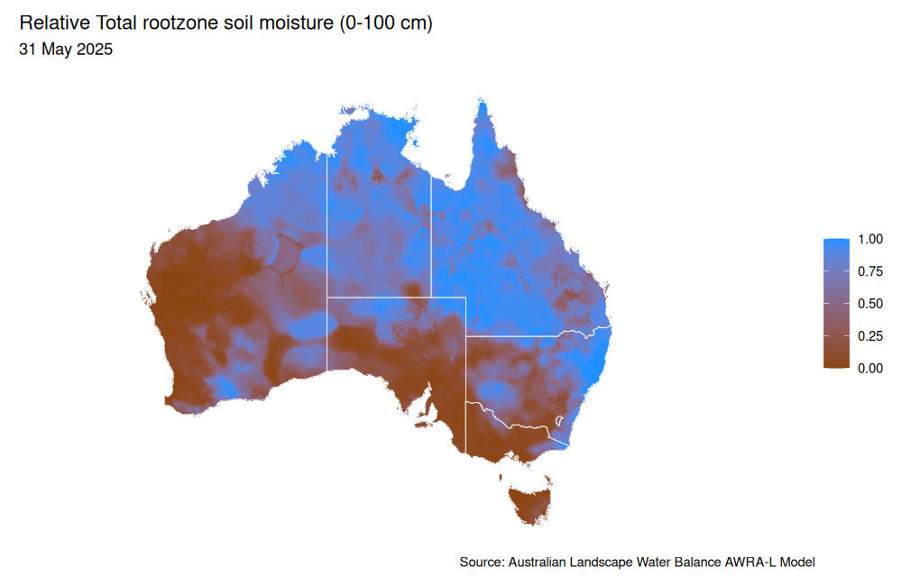
With the ggmap package we can add some mapping tiles. You will need a Google Maps API to enable this functionality.
  ## Plot on Google Maps
  library(ggmap)

  api <- readLines("case-studies/google-maps.api") # Text file with the API key
  register_google(key = api)

  ggmap(get_map("Australia", zoom = 4, color = "bw")) +
    geom_tile(data = soil_moisture,
              aes(x = longitude, y = latitude, fill = value), alpha = 0.5) +
    scale_fill_gradient(low = "chocolate4", high = "dodgerblue", name = NULL) +
    labs(title = "Relative Total rootzone soil moisture (0-100 cm)",
         subtitle = format(as.Date(plot_date), "%d %B %Y"),
         caption = "Source: Australian Landscape Water Balance AWRA-L Model") +
    theme_void()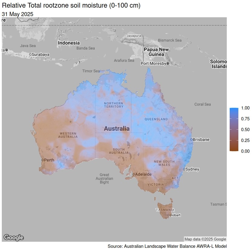
Analysing the data
For my analysis, I am interested in the time series of moisture data for a specific point on the map. The previous code slices the data for all location at a specific month.
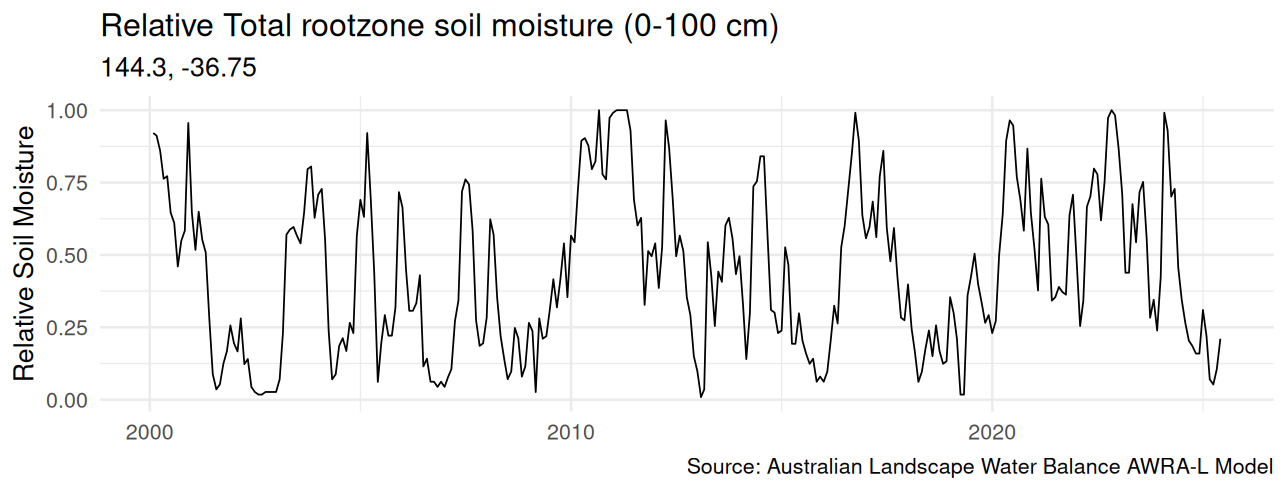
We can also pierce the data vertically for a particular coordinate to create a time series. The coordinate needs to be rounded to the nearest 0.05 decimal degrees to match the source data.
This time series was used to investigate the relationship between sewer main blockages and deep soil data, which can be a topic for a future post.
  ## Time series
  location <- round(geocode("Bendigo, Australia") / 0.05) * 0.05

  soil_moisture_time <- tibble(month,
                               moisture = moisture[as.character(location$lon),
                                                   as.character(location$lat), ]) %>%
    filter(month >= "2000-01-01")

  ggplot(soil_moisture_time) +
    geom_line(aes(x = month, y = moisture)) +
    labs(title = "Relative Total rootzone soil moisture (0-100 cm)",
         subtitle = paste(as.character(location), collapse = ", "),
         caption = "Source: Australian Landscape Water Balance AWRA-L Model",
         x = NULL, y = "Relative Soil Moisture") +
    theme_minimal(base_size = 16)

Data Science for Water Utilities
Data Science for Water Utilities published by CRC Press is an applied, practical guide that shows water professionals how to use data science to solve urban water management problems using the R language for statistical computing.
Share this content
