Visualise Water Consumption with a Geographic Bubble Chart

Peter Prevos |
569 words | 3 minutes
Share this content
A geographic bubble chart is a straightforward method to visualise quantitative information with a geospatial relationship. Last week, I was in Vietnam helping the Phú Thọ Water Supply Joint Stock Company with their data science. They asked me to create a map of a sample of their water consumption data. In this post, I share this little ditty to explain how to plot a bubble chart over a map using the ggmap package.
In this post, I share this little ditty to explain how to plot a bubble chart over a map using the ggmap package. Thanks to Ms Quy and Mr Tuyen of Phu Tho Water for their permission to use this data. Other posts on this blog detail how to analyse water consumption from digital metering data.
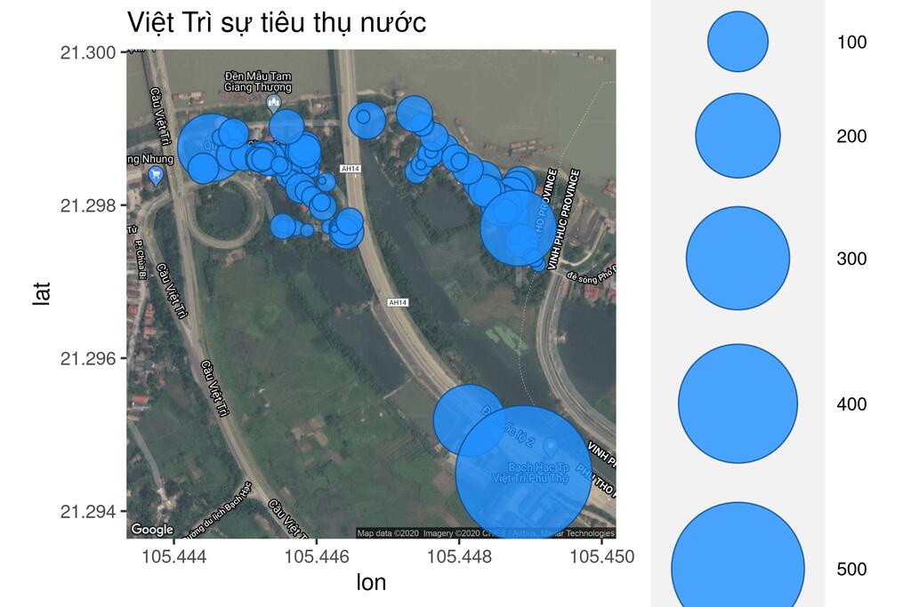
This map visualises water consumption in the targeted area of Việt Trì. The larger the bubble, the larger the consumption. It is no surprise that two commercial customers used the most water.

Load and Explore the Data
The sample data contains a list of just over 100 readings from water meters in the city of Việt Trì, Vietnam, along with their geospatial locations. This data uses the World Geodetic System of 1984 (WGS84), compatible with Google Maps and similar systems.
  # Water consumption bubble chart

  water <- read.csv("data/viet-tri-consumption.csv")
  water$Consumption <- water$read_new - water$read_old

  ## Summarise the data
  summary(water$Consumption)
Consumption per connection ranges from 0 to 529 cubic metres, with an average of 23.45 cubic metres.
Visualise the data with a geographic bubble chart
With the ggmap extension of the ggplot package, we can visualise any spatial data set on a map. The only condition is that the spatial coordinates are in the WGS84 datum. The ggmap package adds a geographical layer to ggplot by providing a Google Maps or OpenStreetMap canvas. The first step is to download the map canvas. You need to know the centre coordinates and the zoom factor to do this. Determining the perfect zoon factor requires some trial and error. The ggmap package provides for various map types, which are described in detail in the documentation. You will need a Google Maps API to enable this functionality.
  ## Plot on Google Maps
  library(ggmap)

  api <- readLines("data/google-maps.api") # Text file with the API key
  register_google(key = api)

  centre <- c(mean(range(water$lon)), mean(range(water$lat)))
  viettri <- get_map(centre, zoom = 17, maptype = "hybrid")
  g <- ggmap(viettri)
The ggmap package follows the same conventions as ggplot. We first call the map layer and then add any required geom. The point geom creates a nice bubble chart when combined with the scale_size_area option. This option scales the points to a maximum size to ensure they are easily visible. The transparency (alpha) minimises the problem of overplotting. This last code snippet plots the map with water consumption.
  # Add data to ggmap
  g + geom_point(data = water, aes(x = lon, y = lat, size = Consumption),
                 shape = 21, colour = "dodgerblue4", fill = "dodgerblue",
                 alpha = .8) +
    scale_size_area(max_size = 30) + # Size of the biggest point
    ggtitle("Việt Trì sự tiêu thụ nước")

Data Science for Water Utilities
Data Science for Water Utilities published by CRC Press is an applied, practical guide that shows water professionals how to use data science to solve urban water management problems using the R language for statistical computing.
Share this content
