Cheesecake Diagrams: Pie Charts with a Different Flavour

Peter Prevos |
1167 words | 6 minutes
Share this content
Part of my job at a regional water utility involves visualising operational data. We manage water and sewerage services for a large number of small and medium-sized towns in regional Victoria (Australia). Traditionally, performance reports consist of extensive tables filled with numbers with a line for each city. To make this data easier to consume, I developed the cheesecake diagram to spatially visualise performance data. A cheesecake diagram is just like a pie chart, but different. It is a semantic glyph rather than a statistical one.
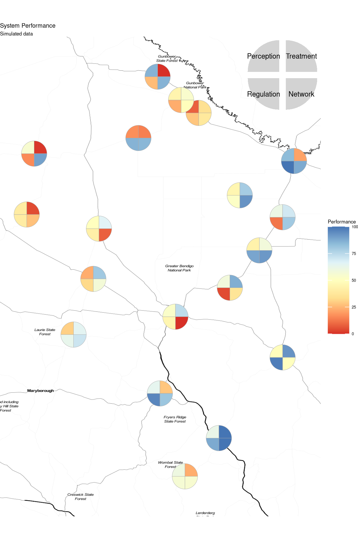
In a pie chart the data is encoded with the angle of each slice. In a cheesecake diagram, the size of all slices is the same, but the colour of the slice indicates data. This method of visualisation is ideal for amalgamating multiple traffic light performance indicators by plotting the cheesecakes in a map.
The code for this article is available on GitHub:
Reporting performance spatially
Displaying geographic performance requires geometric objects at appropriate locations. The geographic bubble chart visualises a single quantitative variable through the size of the circles, plus a second qualitative variable through the colour.
The performance data is randomised for the purpose of this example. Performance is measured using four aggregated parameters. My paper on visualising water quality performance describes the algorithm in detail.
The size of the bubbles in the diagram below communicates the consumed volume of water. Due to the orders of magnitude difference in town size, the area is transformed with the square root. The colour of the bubble communicates a random level of performance.
In most traffic-light reporting systems, the colour for negative performance is red and excellent performance is green. This combination is, however, not useful for the 8% of men who struggle to see the difference between red and green. The RColorBrewer package provides several diverging colourblind-safe colour palates.

The first part of the code creates mock performance data. The geocode function of the ggmap package provides the latitude and longitude for each location. The consumption data is taken from the 2019 Coliban Water annual report. The data has a row for each location, the total consumption, four performance variables and the average over these four.
The background map comes from Stamen Design, under CC BY 3.0. Data by OpenStreetMap, under ODbL. The second part of the code projects the point geometry on the map and sets the scales and labels. The toner version of the Stamen maps is ideal for this visualisation because of its sparse background.
The next section shows how to split these bubbles into quadrants to separately visualise each variable.
  ## Cheesecake diagram
  library(tidyverse)
  library(ggmap)
  library(RColorBrewer)

  ## Register Google Maps API
  api <- readLines("case-studies/google-maps.api")
  register_google(key = api)

  ## Create mock performance data
  ## Towns with water treatment plants
  towns <- c("Bendigo", "Boort", "Bridgewater", "Castlemaine", "Cohuna", "Echuca", "Elmore", "Goornong", "Gunower", "Heathcote", "Korong Vale", "Kyneton", "Laanecoorie", "Leitchville", "Lockington", "Pyramid Hill", "Rochester", "Serpentine", "Trentham")
  t <- length(towns)

  ## Volume produced
  ## https://www.coliban.com.au/files/2019-10/FINAL_CW_AnnualReport2019_200919pm.pdf p. 24
  consumption <- c(11682, 138, 141, 2064, 610, 3017, 106, 44, 48, 243, 117, 862, 106, 161, 55, 84, 857, 17, 94)

  set.seed(1969)
  performance <- tibble(Town = towns) %>%
      bind_cols(geocode(paste(towns, "Victoria, Australia"))) %>%
      mutate(Consumption = consumption,
             Treatment = sample(0:100, t),
             Network = sample(0:100, t),
             Regulation = sample(0:100, t),
             Perception = sample(0:100, t),
             Performance = round((Treatment + Network + Regulation + Perception) / 4))

  ## Get map
  bbox <- make_bbox(range(performance$lon), range(performance$lat), f = .1)
  map <- get_stamenmap(bbox, maptype = "toner-hybrid")

  ## Single variable
  ggmap(map, extent = "device") +
      geom_point(data = performance,
                 aes(lon, lat, size = sqrt(Consumption), col = Performance),
                 alpha = 0.9) +
      scale_size_area(max_size = 24, guide = "none") +
      scale_color_gradientn(colors = brewer.pal(7, "RdYlBu")) +
      labs(title = "System Performance",
           subtitle = "Simulated data") +
      theme_void(base_size = 8)
Introducing the Cheesecake Diagram
If we want to report more than one variable per location, the circle needs to he divided into two or more sectors. While this might sound like a pie chart, it is not. A pie chart visualises information through the size of the sectors in the diagram. The colours of the sectors communicate the data categories. Visualisation experts generally discourage using pie charts because they are not easy to interpret, but cheesecake diagrams are different.
A cheesecake diagram visualises information through the size of the circle and the colour of the sectors. The size of the sector is the same for each. A cheesecake diagram is a type of pie chart, but with a different flavour. The cheesecake diagram should not be used for more than four slices to ensure it remains readable.
The Scatterpie package provides functionality to plot pie charts on a map, but it does not allow you to link the colours to the aesthetics. The code below uses the powerful ggforce package to construct the cheesecakes from four circle sectors. To create the sectors, the performance data frame is pivoted, and each sector is defined by its starting and ending angle, being 90 degrees ($\pi/2$ radians). Because the circle now contains information, it is not sized to the level of consumption to keep the sectors clearly visible.
Adding the legend is a bit finicky. The annotation_custom() function allows you to plot two ggplot graphs on top of each other. In this case we need to transform the coordinate systems to match as the map is in latitude /longitude and the legend .
  ## Cheesecake diagram
  library(ggforce)
  library(gridExtra)

  ## Convert data
  cheesecake = pivot_longer(performance, -1:-4,
                            names_to = "Aspect",
                            values_to = "Performance") %>%
    filter(Aspect != "Performance") %>%
    mutate(start = rep(seq(0, 2 * pi, length.out = 5)[-5], t),
           end = rep(seq(0, 2 * pi, length.out = 5)[-1], t))

  ## Legend
  cheesecake_legend <- tibble(x0 = c(.1, .1, -.1, -.1),
                              y0 = c(.1, -.1, -.1, .1),
                              start = seq(0, 2 * pi, length.out = 5)[-5],
                              end = seq(0, 2 * pi, length.out = 5)[-1],
                              dimension = unique(cheesecake$Aspect))

  l <- ggplot(cheesecake_legend) +
    aes(x0 = x0, y0 = y0, r0 = 0, r = 1, start = start, end = end) +
    geom_arc_bar(col = NA, fill = "lightgrey") +
    geom_text(aes(x0 * 6, y0 * 6,
                  label = unique(cheesecake$Aspect)), size = 2) +
    theme_void() +
    coord_equal()

  ## Visualise
  m <- ggmap(map, extent = "device",
             base_layer = ggplot(data = cheesecake,
                                 aes(x0 = lon,
                                     y0 = lat,
                                     r0 = 0,
                                     r = .05,
                                     start = start,
                                     end = end,
                                     fill = Performance))) +
    geom_arc_bar(col = "darkgrey", size = .1) +
    scale_size_area(max_size = 12, guide = FALSE) +
    scale_fill_gradientn(colors = brewer.pal(7, "RdYlBu")) +
    labs(title = "System Performance",
         subtitle = "Simulated data")  +
    theme_void(base_size = 4)

  m + coord_cartesian() + coord_equal() +
    annotation_custom(grob = ggplotGrob(l),
                      xmin = bbox[3] - .3, xmax = bbox[3],
                      ymin = bbox[4] - .3, ymax = bbox[4])

Data Science for Water Utilities
Data Science for Water Utilities published by CRC Press is an applied, practical guide that shows water professionals how to use data science to solve urban water management problems using the R language for statistical computing.
Share this content
