
Analyse Digital Water Meter Data using the Tidyverse

Peter Prevos |
1101 words | 6 minutes
Share this content
In last week's article, I discussed how to simulate water consumption data to help develop analytics and reporting. This post describes how to analyse digital water meter data and create a diurnal consumption curve.
The code is available in the GitHub repository in the case-studies folder.
Data Source
The simulated data consists of three fields:
device_id: Unique identifier of the digital water meter.timestamp: Time stamp in Coordinated Universal Timecount: Cumulative count of pulses.
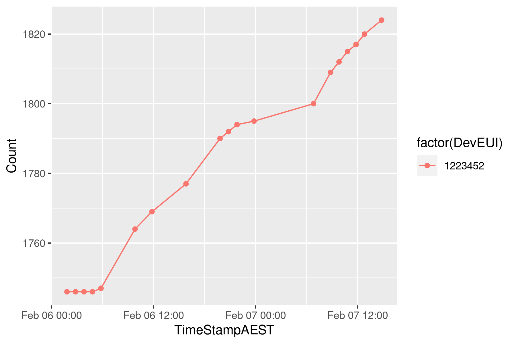
Note that all data is recorded in UTC. The digital water meters send an hourly pulse at a random time within the hour. Each transmitter (RTU) uses a random offset to avoid network congestion. The digital meter counts each time the impeller makes a full turn, and for this analysis, we assume that this equates to a five-litre volume. The ratio between volume and count depends on the meter brand and type. The image below shows a typical data set for an RTU, including some missing data points.
To analyse the data we need two auxiliary functions: one to slice the data we need and one to interpolate data for the times we need it. The Tidyverse heavily influences the code in this article. I prefer the Tidyverse way of doing things because it leads to elegant code that is easy to understand.
  ## Analyse digital meter data
  library(tidyverse)
  library(lubridate)
  library(magrittr)

  # Load data
  meter_reads <- read_csv("data/meter_reads.csv")
  rtu <- unique(meter_reads$device_id)
Prepare the Analysis
To construct a diurnal curve we need to slice to data to the required window and interpolate the hourly flows.
Slicing Digital Water Metering Data
Analysis is undertaken on slices of the complete data set. This function slices the available data by a vector of RTU ids and a timestamp range in AEST. This function adds a new timestamp variable in AEST. If no date range is provided, all available data for the selected RTUs is provided. The output of this function is a data frame (a Tibble in Tydiverse language).
  # Slicing meter reads

  slice_reads <- function(rtus, dates = range(meter_reads$timestamp)) {
    filter(meter_reads, device_id %in% rtus) %>%
      filter(timestamp >= as.POSIXct(dates[1], tz = "UTC") &
             timestamp <= as.POSIXct(dates[2], tz = "UTC")) %>%
      arrange(device_id, timestamp)
  }

  slice_reads(rtu[12], c("2050-02-12", "2050-02-13"))
Interpolation of Meter Reads
This function interpolates the cumulative counts for a series of RTUs over a vector of timestamps in AEST. The function creates a list to store the results for each RTU, interpolates the data using the approx function and then flattens the list back to a data frame. The interpolation function contains a different type of pipe because the approx for interpolation function does not take a data argument. The %$% pipe from the Magrittr package solves that problem.
The output is a data frame with DevEUI, the timestamp in AEST and the interpolated cumulative count. The image above shows the counts for two meters over two days an the graph superimposes an interpolated point over the raw data. Although the actual data consists of integer counts, interpolated values are numeric values. The decimals are retained to distinguish them from real reads.
  # Interpolation

  interpolate_count <- function(rtus, timestamps) {
      timestamps <- as.POSIXct(timestamps, tz = "UTC")
      results <- vector("list", length(rtus))
      for (r in seq_along(rtus)) {
          interp <- slice_reads(rtus[r]) %$%
              approx(timestamp, count, timestamps)
          results[[r]] <- data_frame(device_id = rep(rtus[r],
                                                     length(timestamps)),
                                     timestamp = timestamps, count = interp$y)
      }
      return(do.call(rbind, results))
  }

  interpolate_count(rtu[2:3], seq.POSIXt(as.POSIXct("2050-02-01"),
                                         by = "day", length.out = 3))

  sample <- 4:5

  slice_reads(rtu[sample], c("2050-02-01 20:00", "2050-02-02 04:00")) %>%
      ggplot(aes(timestamp, count, col = factor(device_id))) +
      geom_line() +
      geom_point() +
      geom_point(data = interpolate_count(rtu[sample], "2050-02-02 00:00"),
                 col = "blue", size = 3) +
      facet_wrap(~device_id, scale = "free_y") +
      ggtitle(paste("Device", rtu[2:3])) +
      theme_bw(base_size = 10)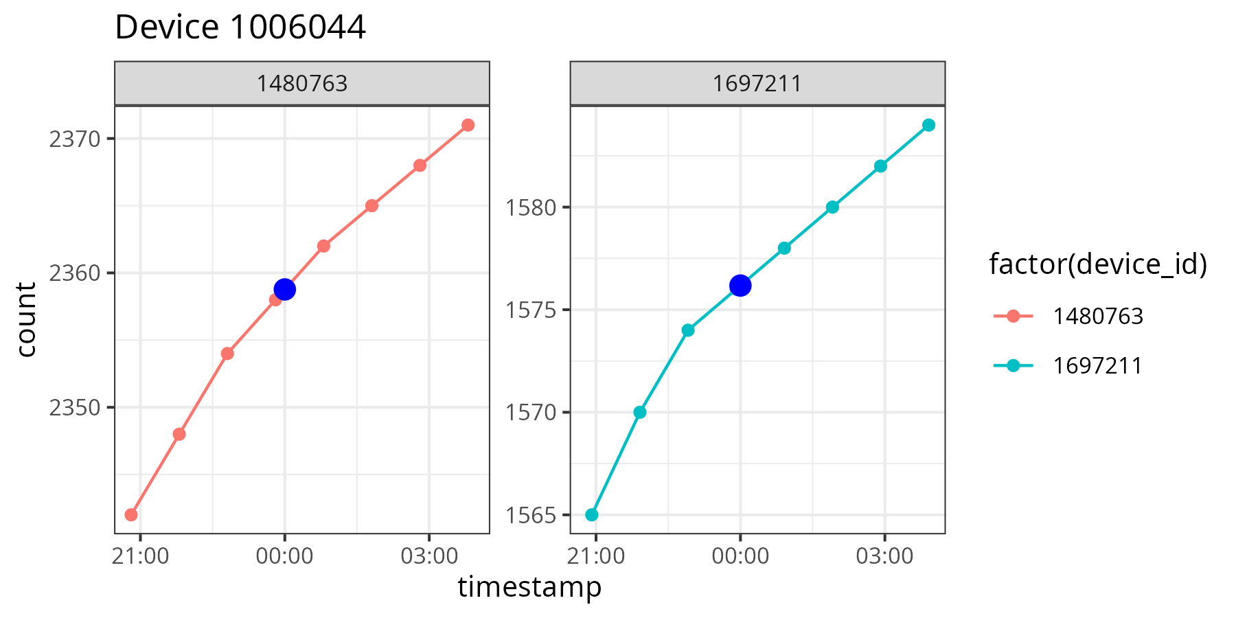
With these two auxiliary functions, we can start analysing the data.
Analyse Daily Consumption
Daily consumption for each connection is a critical metric in managing water resources and billing customers. The daily consumption of any water connection is defined by the difference between the cumulative counts at midnight. The interpolation function makes it easy to determine daily consumption. This function interpolates the midnight reads for each of the RTUs over the period, starting the previous day. The output of the function is a data frame that can be piped into the plotting function to visualise the data. When you group the data by date, you can also determine the total consumption over a group of services.
  # Daily consumption
  daily_consumption <- function(rtus, dates) {
    timestamps <- seq.POSIXt(as.POSIXct(min(dates), tz = "UTC") - 24 * 3600,
                             as.POSIXct(max(dates), tz = "UTC"), by = "day")
    interpolate_count(rtus, timestamps) %>%
      group_by(device_id) %>%
      mutate(consumption = c(0, diff(count)) * 5) %>%
      filter(timestamp != timestamps[1])
  }

  daily_consumption(rtu[32:33], c("2050-02-01", "2050-02-07")) %>%
    ggplot(aes(timestamp, consumption)) +
    geom_col() +
    facet_wrap(~device_id) +
    theme_bw(base_size = 10) +
    ggtitle("Daily consumption")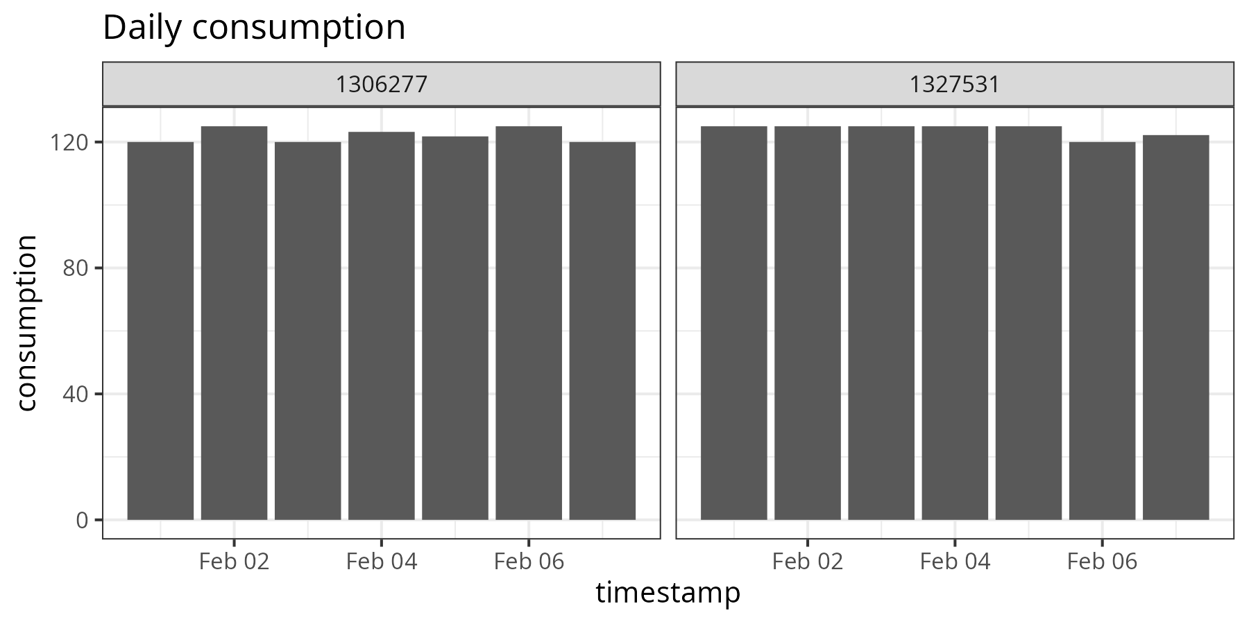
Diurnal Curves
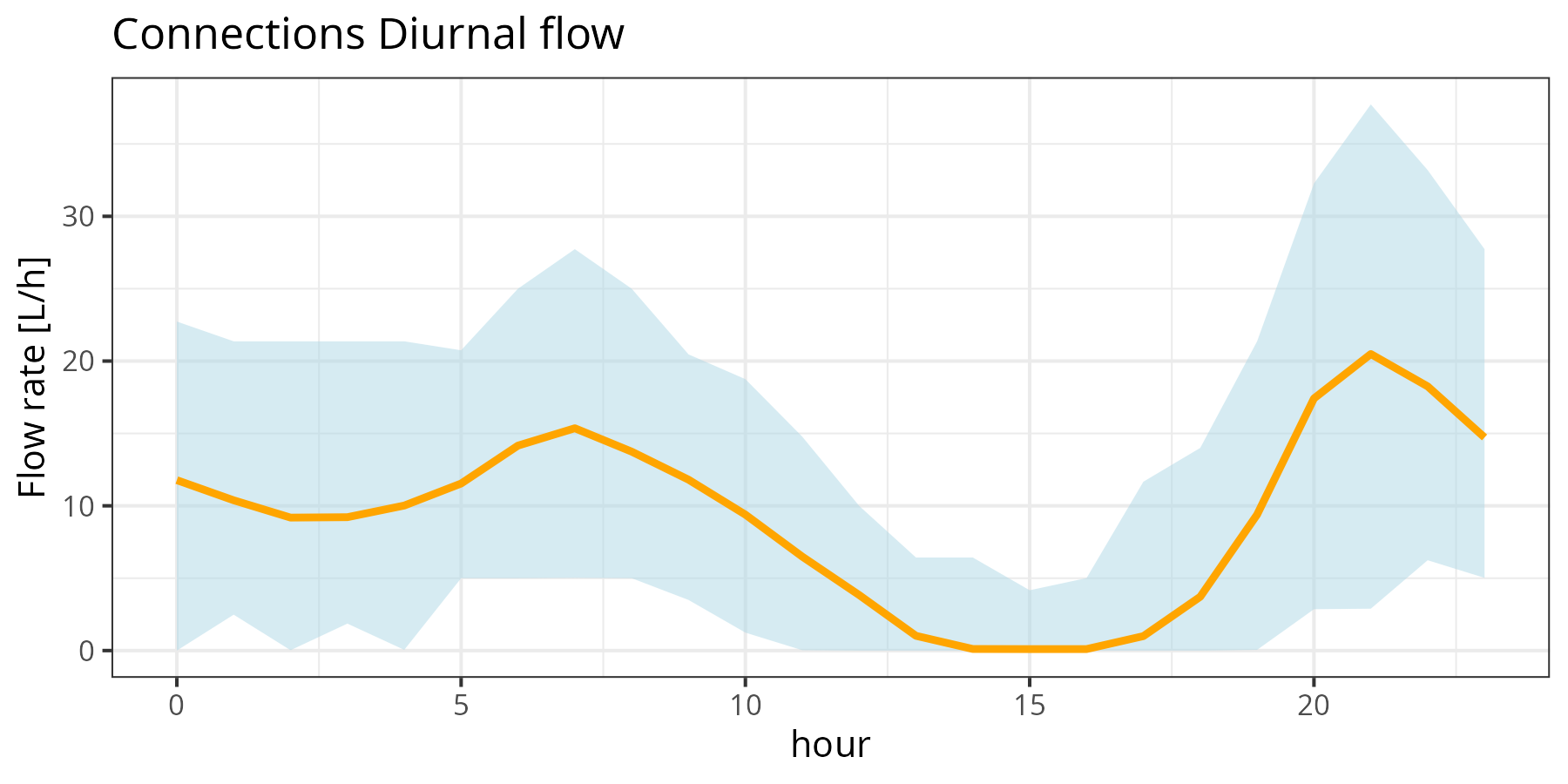
The diurnal curve is one of the most important pieces of information used in the design of water supply systems. This curve shows the usage of one or more services for each hour in the day. This curve is a reflection of human behaviour, as we use most water in the morning and the evenings.
This function slices data for a vector of RTUs over a period and then plots the average diurnal curve. The data is obtained by interpolating the cumulative counts for each whole hour in the period. The function then calculates the flow in litres per hour and visualises the minimum, mean and maximum value.
  # Diurnal curves

  plot_diurnal_connections <- function(rtus, dates) {
    timestamps <- seq.POSIXt(as.POSIXct(dates[1], tz = "UTC"),
                             as.POSIXct(dates[2], tz = "UTC"), by = "hour")
    interpolate_count(rtus, timestamps) %>%
      group_by(device_id) %>%
      mutate(rate = c(0, diff(count * 5)),
             hour = as.integer(format(timestamp, "%H"))) %>%
      filter(rate >= 0) %>%
      group_by(hour) %>%
      summarise(min = min(rate), mean = mean(rate), max = max(rate)) %>%
      ggplot(aes(x = hour, ymin = min, ymax = max)) +
      geom_ribbon(fill = "lightblue", alpha = 0.5) +
      geom_line(aes(x = hour, y = mean), col = "orange", linewidth = 1) +
      ggtitle("Connections Diurnal flow") +
      ylab("Flow rate [L/h]") +
      theme_bw(base_size = 10)
  }

  plot_diurnal_connections(rtu[10:20], c("2050-02-01", "2050-03-01"))
Boxplots are also an informative way to visualise this curve. This method provides more statistical information on one page, and the ggplot function performs the statistical analysis.
Analysing digital metering data is explained in more detail in chapter 11 of Data Science for Water Utilities.

Data Science for Water Utilities
Data Science for Water Utilities published by CRC Press is an applied, practical guide that shows water professionals how to use data science to solve urban water management problems using the R language for statistical computing.
Share this content
